︎ Cathay Pacific (2023 - Present)
UX DesignerCurrently with Cathay Pacific's UX Design team, working on several projects - some of which can’t really be shown here due to confidentiality reasons. Below is an overview of a project I led back in late 2023 - which has since launched on the live site. The approach and strategy we took became the blueprint for reorganizing content structure across the different key business pillars of Cathay Pacific’s website.

︎︎︎
Flights Navigation Overhaul
The Flights navigation tab is the most visited and interacted with part of the Cathay Pacific website. Before the overhaul, the tab contained 7 different subcategories and 44 unique entry points to different pages. As a result of this convoluted and overly dense information architecture (IA), many complaints submitted via the website feedback widget consisted of the customer not being able to find what they were looking for. Additionally, due to a constant stream of new content being created and the desire for each respective team’s content to be placed in a prime location for optimal visibility, this has led to an increasingly crowded IA that will only get worse over time.
Challenges
💭️ How do we change the existing navigation without alienating our users?
💭️ How do we consolidate “dead pages” into more intuitive “hub” entry points?
💭️ How do we determine whether “dead pages” are a product of customer disinterest or unintuitive copywriting?
Impact
+52% visits to key pages, +24% visits to sub-pages within hub entry points, +704% visits to pages with refined copywriting
Stakeholders
Brand Insights and Marketing
Sales and Distribution
Team
1 Designer 🖌
2 UX Researchers 🔎
Duration
1.5 Months
Problem Space
Before iterating on a new IA, we identified the problem space - categorizing it into 3 main categories.

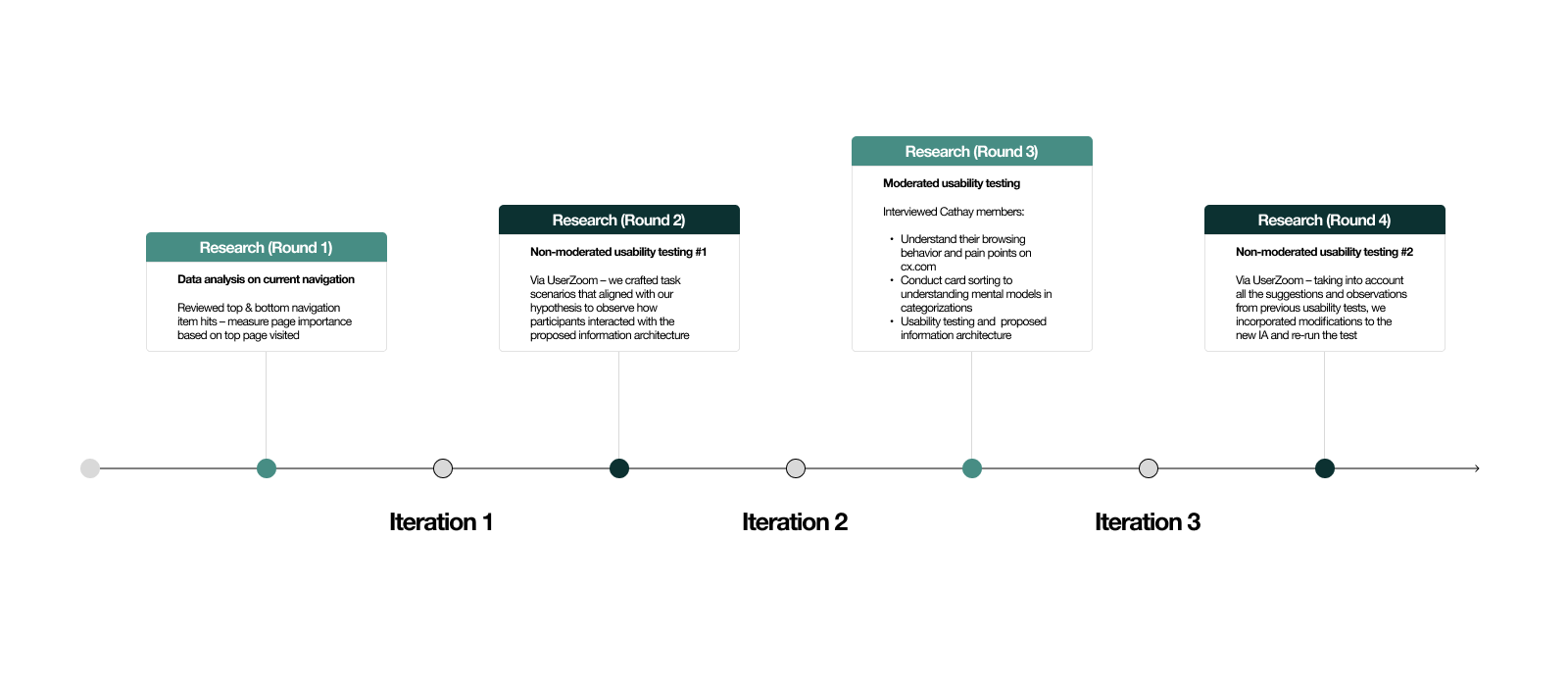
Research + Design methodology
After identifying the problem space and observing the current click through rates of the existing IA - we went to work in drafting a step-by-step research and design methodology. This methodology included 4 rounds of research (moderated and unmoderated) and 3 different iterations of drafting a new structure for the Flights IA.
Research #1 - Existing feedback from users
For the first round of research, we took a look at the existing data we had collected from users submitting feedback on our feedback widget on the website. We found out that the top reason a customer would give 3 stars or below was because they couldn’t find the information they were looking for.


Iteration #1
With the website data just shown, we strategically grouped together certain dead links and consolidated them within single entry points. We’ve also trimmed down the total number of categories within the IA from 7 to 4.
For example, instead of having individual entry points for Inflight Entertainment, Inflight Dining, Inflight Shopping, Inflight Wifi – we went ahead and consolidated that into Inflight experience. In addition, we eliminated low traffic pages like Reasons to book direct with us, opting to have those entry points elsewhere instead, such as within page content.
We iterated 4 different IA proposals between each round of moderated and unmoderated testing based on the different feedback and data we got. This thorough progression allowed us to fine tune our designs after each round of testing for hopefully more accurate results and better designs.

Research #2 - Unmoderated usability testing
Our first round of testing consisted of unmoderated user tests conducted on UserZoom. Our approach with unmoderated tests was to give users certain tasks to see if they could click on the correct entry point. Our requirement for the participants was that they had to have booked and managed their flight online before, so they know their way around an airline website at some capacity.
We tested with a total number of 50 participants.
An example of a question we asked users was how would they go about upgrading their seat from Economy to Premium Economy? As you can see in the sample question heat map, a lot of users selected Upgrade your experience, which is one of the correct choices, in addition to Manage Booking.
Test approach
❓️ Click test - 9 behavioral questions
👽️ Participant information - 50 participants, have booked/managed flights online before
📌️ Objectives - Conduct tests on key hypotheses, e.g. evaluating the effectiveness of renaming "Travel extras“, assessing the potential benefits of centralizing information through the “hub” concept
Sample question:
![]()

Test results:
![]()

Taking a closer look at the test results - we can see with Travel extras, users clicked into Manage booking instead. It’s still a correct option, but the purpose of this test was to see which page title communicated itself the clearest as upgrading and purchasing add-ons to your flight and travel experience.
We also didn’t want to make too many stark changes to the nomenclature - making too many changes all at once would risk alienating our regular customers whom have likely grown accustomed to the existing navigation.

Iteration #2 + Research #3 - In-depth interviews and revised IA proposal
Our second revised IA is a result of a combination of user interviews and unmoderated testing.
The in-depth user interviews we conducted with existing Cathay Pacific members allowed us to dive deeper into qualitative insights which helped inform our decisions to refine the copywriting of certain entry points within the IA.
Qualitative
📌️ Gain deeper insight into customer needs
📌️ Have a holistic understanding on behaviors, motivations and journeys
📌️ Gain deeper insight into customer needs
📌️ Have a holistic understanding on behaviors, motivations and journeys
Quantitative
📌️ Identify trends and patterns
📌️ Identify areas to focus
📌️ Identify trends and patterns
📌️ Identify areas to focus
Test approach
❓️ Zoom interviews - Moderated card sorting and usability testing
👽️ Participant information - 4 non-members and 4 members, must have booked through official airline websites, 4 have flown with Cathay vs. other competitor airlines
Key Findings
🏁️ Users group by journey or situation
🏁️ Users prioritize actionable items over informational items
🏁️ Priority is given to items and information that directly impact their flights
🏁️ Certain entry points still confused users (see below)
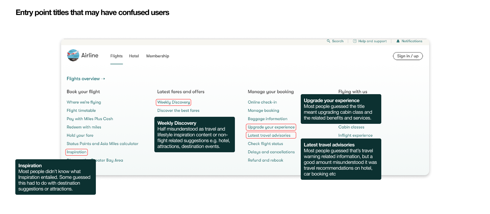
Below is our revised Flights IA proposal based on the feedback received from our user interviews - taking into account what users prioritize and their confusion regarding names of certain entry points.
Some items to note include our decision to list actionable items first, as we realized in our card sorting that users prioritized those items. This means Redeem with miles, Pay with miles plus cash, Online check-in and Manage booking take the top spots in the columns. Also, we kept the wording change from Travel extras to Upgrade your experience.

Iteration #3 + Research #4 - Validation and liaising with stakeholders
Don’t forget - while all this is happening we are still in constant communication with our internal stakeholders. Whilst juggling usability and user insights, we also have to prioritize stakeholder requirements, such as maintaining brand-approved copywriting and prioritizing certain pages (and their positioning).
Test approach
❓️ Click test - 8 behavioral questions
👽️ Participant information - 50 participants, have booked/managed flights online before
📌️ Objectives - Validate name changes, “Inspiration” -> “Inspire your next journey”, “Upgrade your experience” -> “Enhance your travel”
Key Findings
🏁️ Users are more aware of what “Inspire your next journey” entails
🏁️ The difference in the level of user understanding between “Enhance your travel” and “Upgrade your experience” was minor

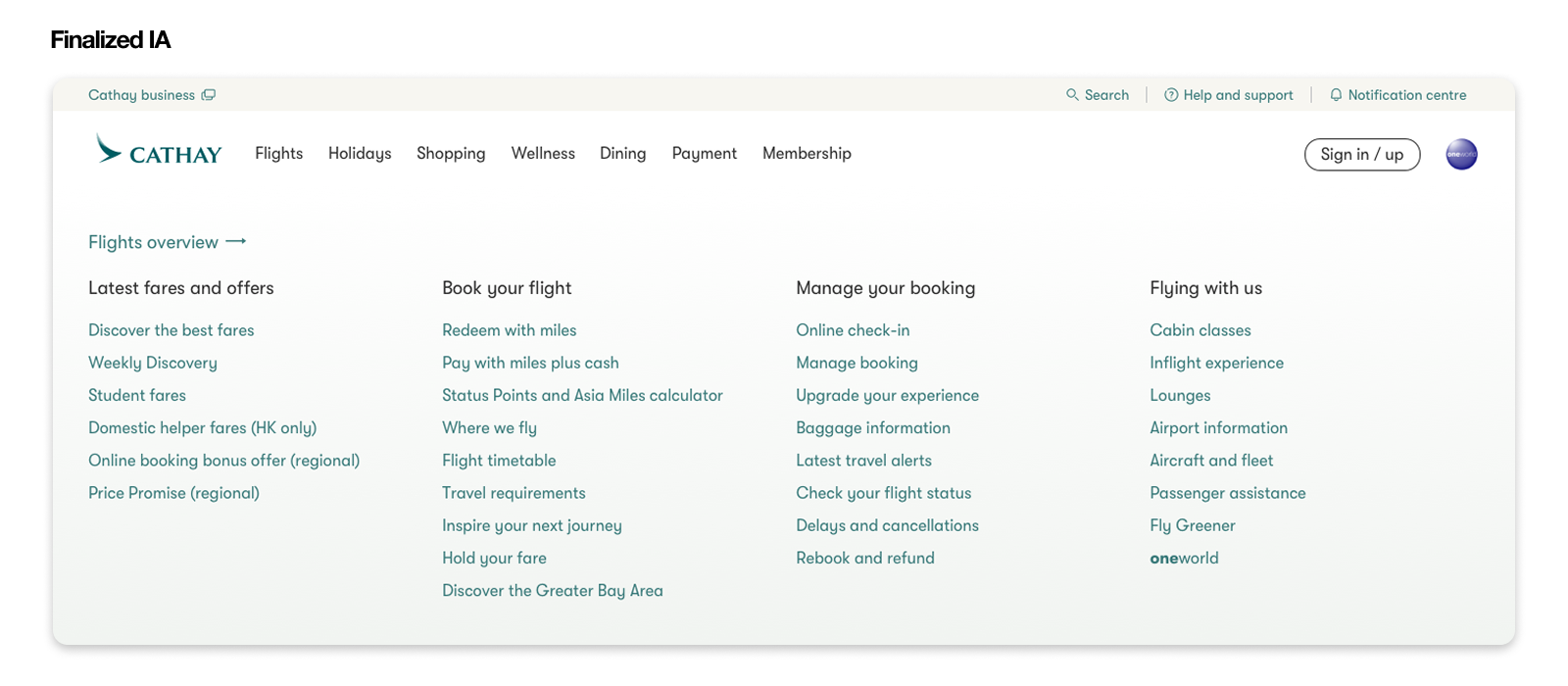
Retrospective - Success metrics and ongoing enhancements
As we round out the project - we focused on 3 key success metrics moving forward to measure how well the new Flights IA was performing. Below is our finalized IA after 4 rounds of research and 3 rounds of design iterations.
1. Increased clicks on navigation entry points across the board, including consolidated entry points and entry points with name changes
2. Reduced # of complaints submitted via feedback widget from customers with the reason “I cannot find the information I’m looking for”
3. Increased visits to previously dead pages (bottom hits) - as a result of a more intuitive organization and grouping of pages
When comparing the original Flights IA to our newly designed one, we managed to cut down navigation subcategories from 7 to 4, and total entrypoints from 44 to 31.


Impact - 6 months later
Closely following the website stats, we gathered and consolidated the data 6 months post-launch of the new Flights IA. Below are a summary of the findings.
Latest fares and offers subcategory entry points experienced an average increase of +52% visits
Previously dead pages now nested within Inflight experience entry point experienced an average increase of +24% in visits
Previously named Travel extras entry point (now known as Upgrade your flight experience) has seen an increase of +704% in click rate
Complaints to do with customers not being able to find what they’re looking for have dropped from 44% to 3%
Moving forward, our methodology and approach became the blueprint for other pillars of the business to follow when reorganizing their respective information architectures.
︎